Research Blog #6: Visual
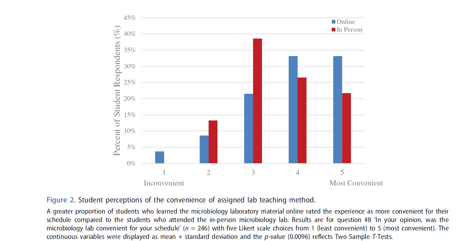
The graph helps illustrate the percentages of people in several income brackets. I can use it to show how many students do not have internet or computer access. This will be used to point out how less affluent students tend to a larger disadvantage when it comes to e-learning.
Source:https://usafacts.org/articles/internet-access-students-at-home/


Just saw this interesting article:
ReplyDeletehttps://www-chronicle-com.proxy.libraries.rutgers.edu/article/did-the-scramble-to-remote-learning-work-heres-what-higher-ed-thinks